 In case you hadn't heard, my good friend RW Spryszak and I put out a literary magazine called THRICE Fiction, and we just finished out our second year with volume number 6. As always, the issue is FREE to download in PDF, eBook, or Kindle formats... just follow this link to our website.
When we first created THRICE, my only interest was having a creative outlet for my fictional writing. I'm not a very good writer, but I am enthusiastic about it, so why not? After the first year, our little literary rag started getting thousands of downloads... exceeding any expectations RW or I could have dreamed. But this unexpected success was bittersweet. Thanks to people far, far more talented than I, THRICE Fiction had outgrown my meager writing talents.
This put me in an awkward position. I wanted a place to write! Why would I want to continue to work on the magazine now? I do graphic design for a living, so having my only contribution be graphic design didn't sound like a lot of fun. It sounded like more work. Which meant that THRICE was probably going to die a quick and horrible death, as so many lit-mag attempts before it.
But then...
...RW started sending me the stories for the next issue.
They were brilliant, captivating, imaginative, and all the things that I actually enjoy reading. And now that I wasn't having to worry about what I was going to write, I could finally appreciate what everybody else was doing. So I decided to stick around.
And ultimately realized that finding ways to come up with something creative for other people was more "fun" than "work."
And so here we are with another year under our collective belt...
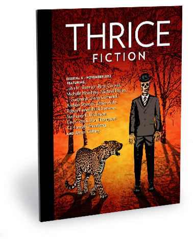
It was not all smooth sailing this time around, however. Two artists who had committed to contributing work had to drop out at the last minute. This left me with no cover plus five additional pieces of artwork that were needed. And this was right in the middle of a very busy travel period, which meant there was no way I could even think about it until December (and it's at this point that I must once again thank Kyra and Chad for not only producing some amazing art, but for getting it to me on time!). Guess I really need to start having firm deadlines for artists like RW does for the writers. Anyway...
When it came to the cover, I kept coming up empty. I had no clue what I was going to do, so I found a random story idea generator on the internet. My first pull was "A FRUSTRATED LEOPARD'S BOWLER HAT IN THE PARK." This was just too insane, so I hit the randomizer again and got "A HAPPY SKELETON'S DREAM DURING ARMAGEDDON." That was even worse. So I combined the two and came up with a frustrated leopard attempting to get his bowler hat back from a skeleton that was dreaming in the park during armageddon. Simple.
I don't know why, but it totally works! The background was grabbed from photo I took of trees in the cemetery. The skeleton was drawn on a yellow pad with a felt-tip pen, using reference pieces I found on the internet (and then scanned). The leopard was traced from a stock photo I bought (because, seriously, I was not going to spend the time trying to figure out how to draw all those spots correctly). Ultimately, I'm pretty happy with it and think everything turned out great. If nothing else, it's colorful.
If you want a "Behind the Scenes" peek at what went on for the rest of the art in THRICE Fiction No. 6... it's all in an extended entry. The art thumbnails are low-res, so you'll be able to see them better if you download the issue...
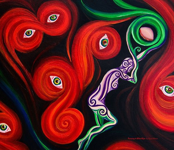
INSIDE FRONT COVER. I always like the reader to get a bit of a shock when they open the magazine to that first page. Not knowing how I was going to top the piece I did for last issue, I gave it to Kyra, knowing full well that she'd come up with something that would provide the visual slap in the face I was looking for. And boy did she deliver.
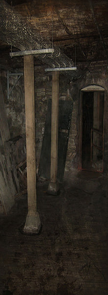
PAGE 2. Since RW changed from "editorials" to "notes," I've tried to make sure that whatever art I put here matches the front cover. This issue was too restrictive given the leopard and skeleton and all, so I deep-sixed that idea and went to a photo I took of the famous Seattle Underground. The reason I selected this one specifically was because this issue had a darker tone, and I wanted the reader to feel that they were following RW into that space. You probably can't see it, but the sign above the dark doorway says "WATCH YOUR STEP," how perfect is that? Processed in Photoshop for a grungy feel.
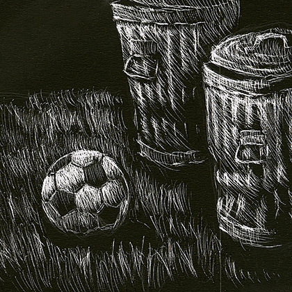
PAGE 3. For Kevin Tosca's Absent, I wanted something with an emotional pull that my various "styles" of artwork just don't seem to capture very well. So I handed it off to Chad, who would know exactly what to do with it. Which, of course, he did. The illustration screams "absent" even if you didn't read a word of Kevin's lovely work.
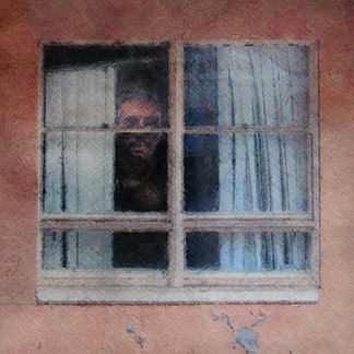
PAGE 4. Don Thompson really found an atmosphere in this piece, and I wanted desperately to match it. But how? Eventually I decided the first thing the reader should see should mirror the last thing Don wrote, so I found a photo of a window I took while ghost-hunting, then painted in a face in there before putting a texture over the whole thing. I worry a bit that I'm just re-telling the story here, but I think the reader won't "get" that until they finish the piece, so I actually think it works really well.
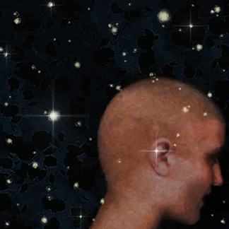
PAGE 5. The minute I read this incredibly powerful piece by Gloria Garfunkel, I spent days trying to wrap my head around it. At first, I thought that a sky full of fireflies was enough. But without an "ear" in there, I thought it fell flat. And thus began a week of trying to figure out exactly what kind of woman to add in. Yes, it's The Holocaust, but to just draw a stereotypical downtrodden woman bereft of hope like you see in the history books would be a grave disservice to what Gloria was trying to say. So I pulled on my experience from visiting Warsaw, and my time spent touring The Holocaust Museum in Cologne, and remembered that, despite it all, these people had a spirit that always came through. And wasn't that what Ash was all about? Initially the woman I painted was blue-toned and cold. So I added warm color. Her face was gaunt and lifeless. So I gave her a spark... a half-smile... some life. I worked and re-worked the painting to try and communicate that the woman was listening to that speck of ash within. If I were painting with acrylics, this would have made me crazy. But I was painting on my iPad, which encourages this kind of experimentation. Ultimately, I don't know that any art could do this story justice. But I tried. I sure tried.

PAGE 6-7. The artist who was originally going to be working on Robyn Parnell's imaginative words had the idea to draw the church floor with a person's shadow on the left and a blood-red tree's shadow on the right (symbolizing the paper with the blood on it). When he had to drop out, I decided to take his idea and run with it, because I thought it was a great intro. To accommodate the art in the best way possible, I went widescreen and ran it across the top of the page. Once I had finished, I thought that the red tree shadow was way too distracting and put too many questions in the head of the reader. That's not my job, so I decided "less is more" and ditched the tree. After that, I thought everything really came together... visually hinting at the story without distracting from it. Just in case you disagree with me, I'm posting the original painting below...

Nah, I totally made the right call.
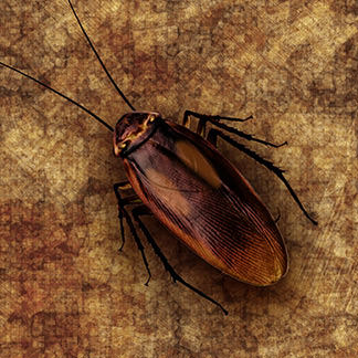
PAGE 8. I have a fear of bugs, in general, and cockroaches, specifically, so I couldn't give away Jaylee Alde's story fast enough! Of course, this was the same artist who had to drop out from pages 6-7, so I ended up getting it back. And thus began a lot of Google searches for cockroach research. Eventually I found a really nice piece of stock photo work that I could paint over... being sure to add the "two brown ovals" to his back. All I had to do then was put him on a nice dingy wallpaper texture and I was done! Once I conquered my fears and got into it, I actually ended up liking the little guy. Jaylee's story was awesome, so that probably helped!
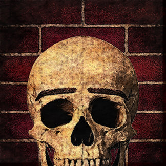
PAGE 9. To say I am a James Claffey fan is a bit of an understatement. He paints with words in a way I can only dream about, and I love the challenge of finding what imagery will best suit his stories. With Softening of the Skull I knew exactly what I wanted to do the minute I got to the painted eyebrows. Putting them on the skull was somewhat obvious, but I think I did it in a way that adds a bit of humor to the mix. The skull is a piece of photo stock that I manipulated fairly heavily. The eyebrows were painted with multiple passes of an Adobe Illustrator brush, which I then molded with a clipping mask. Then I generated a brick texture, layered it all, then kept adding Photoshop filters until it was sufficiently powdered with coal dust.
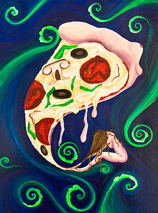
PAGE 10. I wanted, quite badly, to do the art for Michelle Matthees' trio of works myself. I mean, who doesn't want to paint pizza? But, after reading and re-reading the pieces, I knew in my heart that the best man for the job was a woman who could put some perspective in there. Kyra was a blindingly obvious choice, and I'm pretty sure I let loose an audible gasp when I opened her email. I would have never... not in a million years... been this clever. It's one of those things where you look at the art and go "What the heck?" But then read Michelle's words and go "Ah, I get it!" If only I could manage to find that kind of revelation with my work as easily as Kyra does. Oh well. I guess that's why she does this for a living!

PAGE 12. Michael Dickes... who originally hails from up the road from where I live(!)... did a beautiful job of using words to capture a feeling. He did such a beautiful job here, that I didn't have a clue how I might approach the art. Fortunately, I didn't have to. Michael sent along this genius photograph from his brother. I added a little texture to give it a subtle painterly feel, but everything else was just... there.
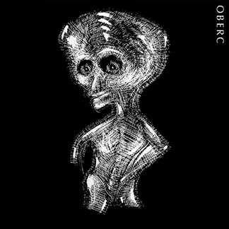
PAGE 13. RW did me the huge favor of introducing me to an old artist colleague, Larry Oberc. The guy has a really interesting style, and provided some awesome pieces for THRICE Fiction No. 4... not all of which I had room for. So imagine my surprise when Eric J. Guignard's The Spanish Dwarf landed in my in-box. It's a really great story, but I feared anything I came up with to illustrate the titular character would end up comical, disrespectful, and probably more than a little stereotypical. And then, just as I was about to give up hope, I remembered back to a wonderful bit of scratchboard art Oberc had sent me. IT. WAS. PERFECT! The image was such a wonderfully expressive and sympathetic piece of art, and reflected how I felt when I read the story. The fact that it was a bit abstract instead of a literal translation also means it "assisted" the story rather than "distracted" from it. Which is my only goal, really. I didn't have anything from Oberc that would work for the second piece, but Chad was happy to step in and help out...
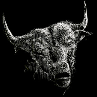
What kills me is that the bull he came up with is not that iconic "Red Bull" look that most every other artist in the world would have bashed out. Oh no. He fed off the sympathetic look of the OBERC piece and created a bull that complimented it beautifully. I guess I shouldn't be surprised, but I really was... and most pleasantly.
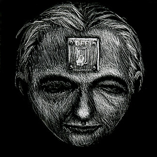
PAGE 17. Okay... if he hadn't said it in his bio, who could have possibly guessed that this was Peter Colwell's first published fiction? Show of hands? Nobody? Yeah, that's what I thought. Once I got to the "dark recollection" part of the story, I knew this was going to Chad before I even got to the end. Surprise again... he went literal with it... and totally managed to pull it off. I think of me trying to get the same feeling from the same idea, and the notion is comical. Hysterical, even. This is kind of a poster child page for what THRICE Fiction can accomplish, I think.
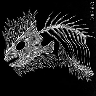
PAGE 18. Andrew Stancek's utterly brilliant and fascinating short story takes a tired idea and just completely blows the doors off of it. I ended up reading through this piece a half-dozen times just to be sure I was actually reading what was registering in my brain. I mean, just LOOK at it! This is my favorite part... "Among the belly-up bodies, Scorpio, his Black Phantom Tetra, gazes at him with an “I should have known” look before he pirouettes in the roiling water where even the Vallisneria plants curl." Who manages to write something like that? Oh... Andrew Stancek does. And, lucky for me, this art by Oberc that I found while rummaging for The Spanish Dwarf eerily fits the story to perfection. I don't know if Oberc like WENT FORWARD IN TIME to read this piece before creating the art, or if Stancek went BACK IN TIME to let Oberc read it before he created it. Regardless, some sort of conspiracy magic is at work here, I'm certain of it. I guess I should just be thankful that I got to be along for the ride.
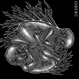
PAGE 19. I was originally going to give KJ Hannah Greenberg's wonderful piece to Kyra. Because Kyra has a great sensibility for these kinds of intrinsically female works that I can't manage to find for some reason! But then I read the story a couple more times and decided that I really wanted A Dearth of Exploitation in Southwark to follow Stancek's piece. It was a kind of "Death - Birth - Death" thing playing in my head, and KJ Hannah's words fit so nicely there. I thought maybe I could come up with something graphical to compliment what OBERC had done on the page opposite. Until I was pulling one of OBERC's sheets off my scanner and saw that he had the perfect compliment already drawn. Apparently KJ Hannah Greenberg is in on this time-traveling conspiracy? We may never know.
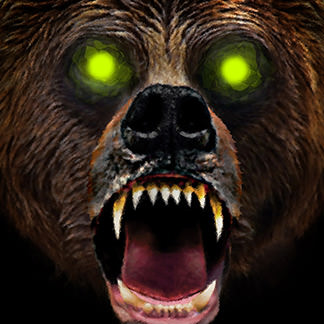
PAGE 21. The hardest part of working with Nick Sansone's story was trying to remember that "Retaliation" only has one "L" in it. Otherwise, he gave me everything I needed... fearing a nightmare of bears and untamed things? Done! At first I just bought a stock photo to paint over... but didn't think it looked nearly scary enough, so I ended up painting something entirely different over the top of it. The larger original had his ears in it, but they looked too cute so I ended up zooming in on his maw. The glowing green eyes just brought it all home for me, and kept something conceptual from looking too real.
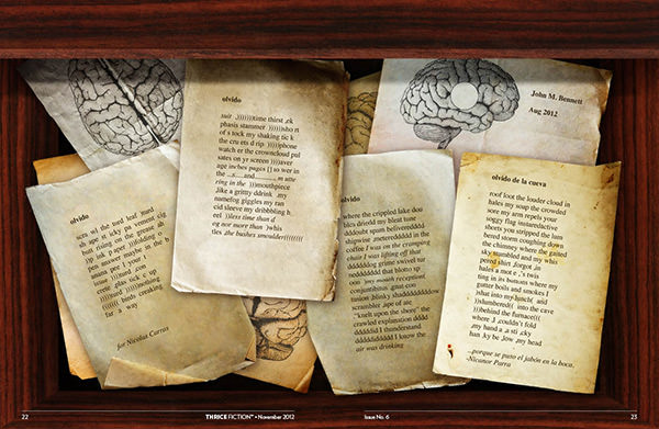
PAGE 22-23, 26. Ah yes... John M. Bennett, at last. Looking at my Spanish/English dictionary, "Olvido" apparently means forgetfulness, oblivion, or oversight. To play on this, I dreamed up the idea of a drawer in a doctor's office that is full of neurology research notes and pages of stories he found that were printed out by somebody who is losing their mind. I started with a wood texture that I then warped into a desk. Then I bought some vintage paper photo stock that I could mould to my layout. These kind of "photo collages" are easy to do badly, but I've made enough of them that it wasn't too much trouble to get working. This is one of those rare instances where the idea in my head looks exactly like what I ended up with. Originally, there were five of Bennett's pieces in the drawer, but when a space opened up later in the magazine, I removed one. I wanted it to feel as though the paper fell out of the drawer and landed a few pages ahead...
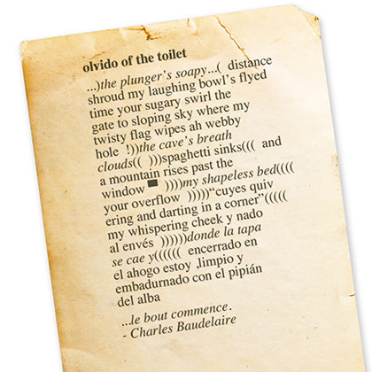
I was THIS CLOSE to putting a toilet in the background after having read through the piece a few times. But who needs that kind of literalism here? Bennett drops words like visions from a half-realized dream, and does a far better job of imagery than I could.
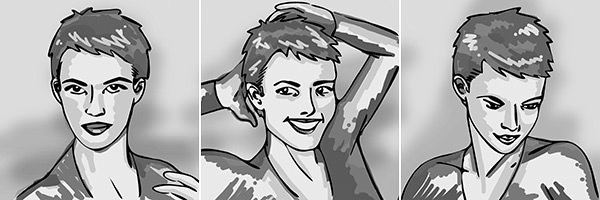
PAGE 24-26. Usually when RW sends me a new story to look over, he gives very little direction. With Stephanie E. Dickinson's Interview with Jean Seberg, Part 4 this was not the case. He had very specific ideas in mind, thinking it might be a good idea to present it in a classic "Playboy Interview" style. After a few other suggestions, he wrapped up his email with "Let me know what you think of the possibilities. It's exceptionally well-written." And of course RW, who is not prone to hyperbole, was absolutely right. I knew very little of Jean Seberg, which is to say I had once heard of her. And what a crime that was. As far as silver screen legends go, she was everything you want in a star (and then some!), and reading Stephanie's "interview" had me running to the internet to learn more about her (the Wikipedia page alone is some fascinating stuff, yet pales in comparison to what you'll read here). Ultimately, I was unable to make the "Playboy Interview" layout work, but I did want to pay homage to RW's idea by planting three candids of Jean Seburg throughout. Ideally, I would have used some public domain photos, but none were to be found. I then started asking around to find somebody who actually knows how to paint people, so they could do the story justice. Nada. Alas, the art ended up falling on me, the last guy on earth who should be attempting to paint a specific person. So... I didn't even try. I just drew up some Seberg-esque sketches based on photo poses I found of her on the internet. Here's hoping they at least pretend to hint at Jean Seberg.
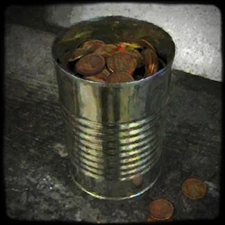
PAGE 27. More brilliance by James Claffey. At first, I had it in my head to do something wildly abstract here. Anything more might draw attention away from what was being built so carefully in the words. And so I did a bamboo-type painting of a brute with a cane, but from an impossible angle that you would never find in reality. And that's when it hit me that I was destroying the very fabric of what Claffey's reality was. So I tossed it and decided to pick out an element... just a small element... and attempt to make it so ordinary and reality-based that it couldn't possibly conflict. I loved the idea of a tin can filled with pennies, so there I went. If you look closely, the pennies are Irish. Using American pennies would be too easy, right?
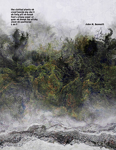
PAGE 28. With two artists out of the picture, I ended up with a blank page in the end credits. Bennett to the rescue! I visited his blog. Clicked on a random month. Scrolled to a random entry. Then copied what I found there to my page. It's the closest thing to finding a literary Cracker Jacks prize that I can think of. I struck gold, and had my head filled with a mass of clotted plants escaping from a fog's crispy sugar. Put that in your sticky clock.
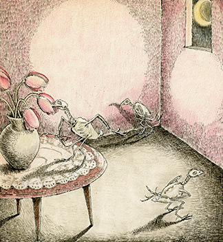
BACK COVER. Chad had created this charming yet mildly disturbing piece when I gave him the back cover. I liked it so much that I wanted it for the front cover once the artist who was working on it disappeared. Alas, I couldn't get it to fit, so it fulfilled its destiny where it was meant to be, I suppose. I thought the picture felt like there was a part of a really good story being told, so I treated it like an illustration in an old children's book. A children's book back when kids were kids and skeleton birds walked the earth.
See you in March for THRICE Fiction No. 7!

I love comments! However, all comments are moderated, and won't appear until approved. Are you an abusive troll with nothing to contribute? Don't bother. Selling something? Don't bother. Spam linking? Don't bother.
PLEASE NOTE: My comment-spam protection requires JavaScript... if you have it turned off or are using a mobile device without JavaScript, commenting won't work. Sorry.

well, y’know, you could always write under an assumed name.
I think we both know I’m not big league material with my writing… no matter what name I’m using! Oh well. THRICE Fiction is still a wonderful creative outlet that I enjoy working on very much, so there’s that.
Congrats on the newest issue! It looks great! And thank you, that made me feel all warm and fuzzy reading that!
I’m just so thrilled you keep wanting to contribute, so thank YOU! 🙂
David, I wanted to thank you for doing such an extraordinary job with your art for my story ASH. I’d love a poster of the two together. I haven’t figured out downloading yet, but it is amazing and moving and also fascinating to read your process. You expressed so well the emotion behind the story. I love what you came up with. I greatly appreciate it. Gloria
When you go behind the scenes, you really go all out. Great look at the creative process.
I’ve enjoyed each issue of THRICE FICTION so far, even the ones I’ve not contributed to. LOL
I’ve downloaded my issue and can’t wait to dig in. You guys do an amazing job. It inspires me!