


 It's a very special edition of Bullet Sunday on
• Marathon! Once again I have somehow managed to be in Chicago during the massive Chicago Marathon. While I was in the lobby of my hotel tonight, somebody was making smart-assed comments to all the runners who had changed out of their running gear, but were still wearing their medals... "It's over! The race is over! You can take off your medals now!" To which I replied "Hey, if I somehow managed to survive running a marathon, I'd never take my medal off!" And it's probably true. I wonder why some people are compelled to crap all over other people's happiness?
• Twins! Usually when people show me a photo of some guy and say he looks like my twin, I just don't see it. This time I totally DO see it. Probably because the sign above his head is spelling it out for me...
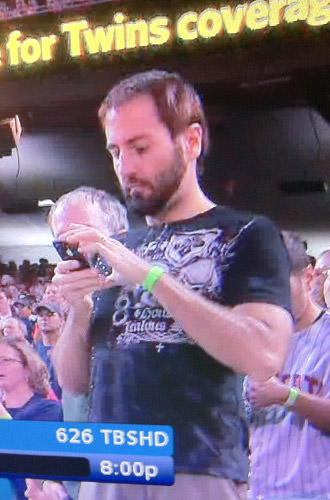
ZOMFG! POD PEOPLE!! Thanks to Damian for confirming that I have a clone running around out there by emailing me this photo. I suspected as much all along.
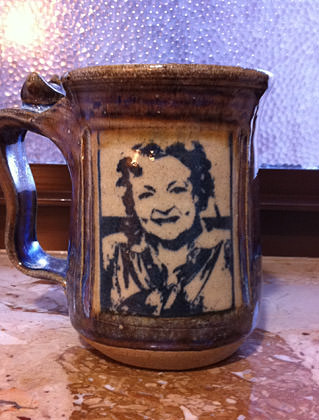
• Betty! Possibly the coolest coffee mug you will ever see...
• Dining! Thanks to a last-minute meet-up with Leah in Chicago, I'm three for three nights of amazing dinners. At home my dinner usually consists of barely edible slop that comes out of the toaster or the microwave. To go from that to something like the gnocchi I had last night (which was so amazing I felt like weeping openly, then lighting the table on fire so I could distract people while I licked the bowl)... well... it's a pretty big shock to my system...
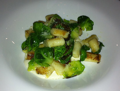
Food to die kill for is not something I want to get used to.
• Gap! The entire internet design community is up in arms over the new logo identity unleashed by The Gap this week. Everyone is shocked and appalled that a beautifully unique logo of timeless elegance, simplicity, and class has been replaced by a generic piece of shit that has no identity at all...
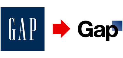
I, on the other hand, am not shocked at all. This is just the latest part of a shitty trend to "update" logos so they read easier at small sizes when displayed on mobile phones, websites, and all the other devices that modern society has embraced...

It's a noble (and probably necessary) endeavor, but it's always being done so badly. And while I'm sure at least some thought went into it, the end result looks exactly like so many of the other unbranded, bland, non-proprietary bullshit logos being churned out that you have to wonder WHAT thought went into it. When it comes to The Gap, it doesn't take a genius to see that their new "logo" is ultimately going to end up doing more harm than good... regardless of all the attention the bad publicity is getting them in the short-run. Sad, but oh-so-typical.
Now it's bye-bye bullets and back to work with me...

I love comments! However, all comments are moderated, and won't appear until approved. Are you an abusive troll with nothing to contribute? Don't bother. Selling something? Don't bother. Spam linking? Don't bother.
PLEASE NOTE: My comment-spam protection requires JavaScript... if you have it turned off or are using a mobile device without JavaScript, commenting won't work. Sorry.
So do you think if you and your doppelganger met, the world would end?
I totally expected a “fixed” Gap logo from you at the end of this post. 🙁 (It’s not like you’ve got anything better to do, right?)
It’s your doppelganger.
The new Gap logo looks silly to me. I much prefer the older logo. It’s the one everyone knows the Gap by.
That wasn’t you?
oh my god, that gnocci looks AMAZING!
That’s NOT you? Wow….
Maybe that IS you at the game, but you later went out, had some Jägermeister and don’t remember it.
Oh that is totally you in the photo. And let me just say a brief WTF in response to the new Gap logo.
There are memos up at work that employees are not allowed to talk to press about the new logo and that it was updated to go with our “new market” of customers.
It’s still dumb.
That guy reminds me of you, but his body is all out of proportion, or something.
In other words, you’re hotter. 🙂
That gnocchi looks delicious!
It’s really hard to believe that wasn’t you in that picture. The only reason I know it’s not you is the lack of hair on his arms (sorry… I have this thing with bodyhair… I notice them…) but boy, otherwise, he really could be your twins (well maybe your less body proportion twins)
That blue box in the new Gap logo looks like an afterthought. And that font is blech.
Is that Betty White mug in your possession? I certainly hope so.
I saw an article on the Gap logo but it did not show a picture. Dumb. I like the old one better.
I would have been upset with the guy talking about the medals. I wore mine at home Sunday night. 🙂 I thought about bringing it to work!
Ugly!
I don’t shop there anyway, so…yeah, don’t care.
That really DOES look like you. But you are cuter.
That new logo for the Gap sucks.
God that gnocchi looks amazing! Unlike the Gap logo, which looks crappy. Now I’m hungry for gnocchi darnit.