
 Welcome to PART TWO of a discussion about the art that's running in the latest issue of THRICE Fiction Magazine!
If you haven't read PART ONE yet, you should do that first.
And if you haven't downloaded a FREE copy of our August 2015 issue... then you should definitely do that first because, WARNING... SPOILERS MAY ENSUE!
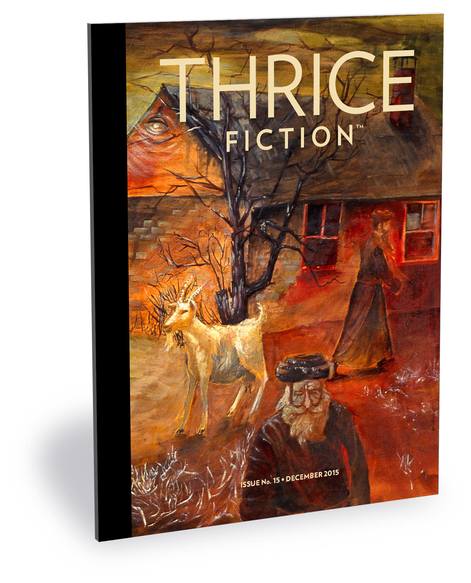
Alrighty then...
It's a forgone conclusion that not all writers are going to be happy with the art that gets paired with their work. And while the idea of such a thing is upsetting to me, I've pretty much made my peace with it. Artwork is highly subjective to begin with, and then you've got to take into account all the possible pitfalls that come with trying to interpret the written word for a visual representation. And it doesn't seem to matter how much detail the writer puts into their story. On the contrary, the more specific the writer is, the more difficult it can be to meet expectations. "I said the main character had a big nose... but I didn't mean THAT big!"
But if the alternative to sometimes getting it wrong from the author's perspective is to have no artwork at all, I think it's a risk worth taking.
Because I can't imagine THRICE Fiction without the art.
And, on that note... on with the show...
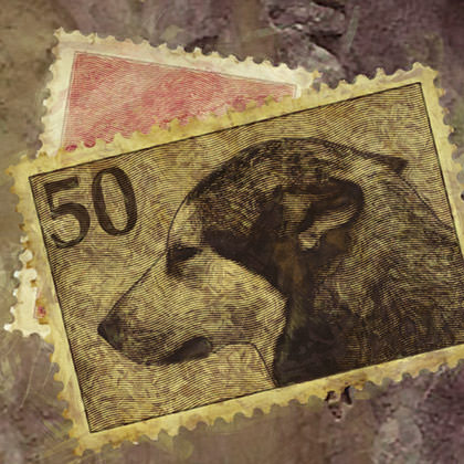
PAGE 13. Fikret Pajalic's Winter Sun is a Lie is about a dog, and so it seems logical the artwork should be dog-related... but there was every chance of getting the breed wrong the color wrong the size wrong or any number of other dog-related details wrong if I were to attempt to show Miki. Fortunately, there was a mention of stamps with dogs on them which allowed me to show dogs without having to show the dog. But I didn't have any dog photos, so I begged some off of Charma Ruland which worked perfectly. I took photos of stamps, erased the design, inserted the dogs, then textured, painted, and added Photoshop filters to grunge them up a bit. To avoid attributing a nationality to the stamps, I didn't use any kind of currency symbol.
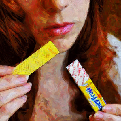
PAGE 15. It was great to see Paul Beckman in our pages again, especially when his name was attached to The Woman with the Juicy Fruit Breath. When it came to the artwork I was thinking... "Striking?" "Cascading red hair?"... if that's not THRICE contributor Kyra Wilson, I don't know what is! So I emailed her begging for a photo of her about to eat a stick of Juicy Fruit. The challenge was not getting her to agree... it was finding Juicy Fruit in the traditional gum-pack form. Everybody only seems to carry MEGA-PACKS or the plastic containers. Eventually I found what we were looking for at Amazon, had it shipped to Kyra, and the photos arrived soon after. After painting over the photo to get the effect I needed, I ran it through a few Photoshop filters to get a painted look... and BLAM... dinner is served.
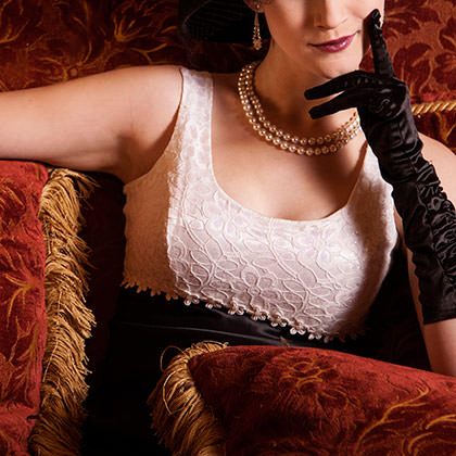
PAGE 17. Usually I position stories in the layout based on how the words flow from one to the next. But in the case of Eliot Deringer's Natalie's Room it was purely the visuals that dictated where it ended up. The lush colors in Katelin Kinney's magnificent photo were so close to what Kyra and I came up with for the previous story that it seemed a great idea to play them one after the other. It's easy to appreciate the beautiful composition of Katelin's shot, but it's the perfect propping that makes this image so captivating to me.

PAGE 19. If there was a perfect opportunity for a serious misstep in finding visuals for this month's stories, A Tribe of Our Own by Greg Roll seemed to be it. Which is why I assigned the story to myself. There was no obvious element to pull from. which made things difficult. Most of the ideas that came to me didn't seem appropriate to the character or, even worse, felt dismissive of transgender persons. I in no way wanted to belittle the struggle that Ray was going through, so I agonized over what image might work. Then, after reading the story for the hundredth time, I realized that when Ray lied to Nick about going to the bathroom, that was my solution. If Ray were going to the bathroom, and he always felt that he was meant to be a woman, then the bathroom she would use... the bathroom of her tribe... would be the women's bathroom. I then searched for a bathroom-like door to photograph, added the sign, went to town in Photoshop, and there you have it.

PAGE 23. Nothing screws with a layout faster than a story with a really long title. And I think Christine Tierney set some kind of record with the day nannette barns heard her brother neil barnes tell ricky c he wanted her dead. Lucky for us, the story was worth the trouble! I thought the seemingly disjointed nature of the prose work work well as a collage, so I turned it over to Chad Yenney to bring us... Nannette Barns! Who seems a little too happy to be overhearing that her brother Neil wants her dead, but the girl hid in the spine of a crinkled dirty magazine, so there's no telling what goes through her head.
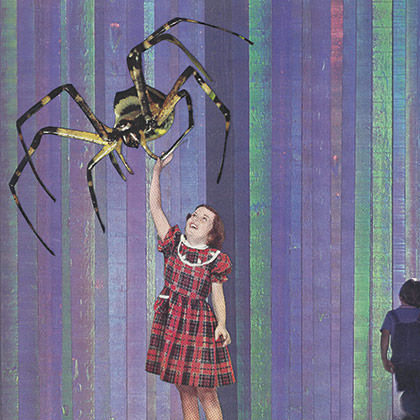
PAGE 25. When I saw the bio for Esther Veitch after reading Courtesy, I noted she was an art student and thought for sure she would want to provide her own visuals. But no visuals were attached, so I decided to put our latest contributor to the test. When Chad sent this collage, I didn't remember the story having a giant spider in it, so I immediately loaded up Courtesy again. Only to realize that the spider was symbolic. Talk about a nasty thought! Well played, Mr. Yenney. Well played.
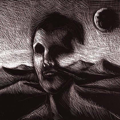
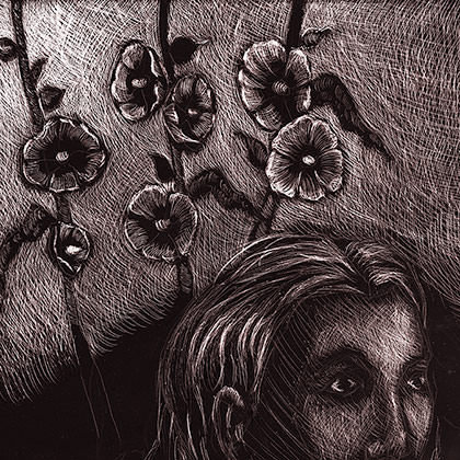
PAGES 26-27. I liked the way that The Passerby (by Mike Corrao) flowed into Welcome (by Melissa Ostrom) so kept them together as the issue took shape. When it came time for the artwork, I sketched out a couple ideas, but none of them fit the tone of the stories. Admitting defeat, I sent them off to Chad Roseburg to work his magic. The haunting images that he sent created one of my favorite spreads ever to appear in THRICE.
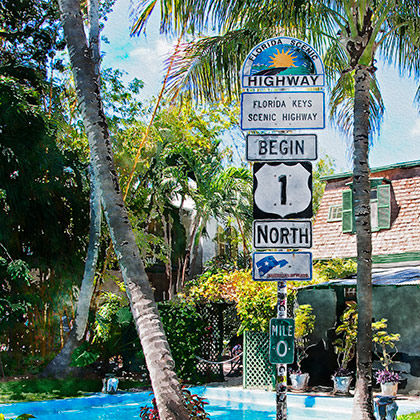
PAGE 29. The minute I saw the "Key West" in Rosemarie Dombrowski's Lessons from Incidents That Might’ve Occurred in Key West, I used art director's prerogative to claim the story for myself. Key West is one of my favorite places on earth, I've been there many times, and I have an extensive collection of photos of The Conch Republic to work with. As I was browsing through my pictures, it occurred to me that one of the "incidents" that "might have occurred" would be somebody stealing the Mile 1 marker and planting it next to the pool at Hemmingway's house. Fortunately I had photos of both. They got composited, manipulated, painted, and then run through watercolor filters in Photoshop. Mission accomplished.
And... that's a wrap for Issue No. 15. See you back here in four months!

I love comments! However, all comments are moderated, and won't appear until approved. Are you an abusive troll with nothing to contribute? Don't bother. Selling something? Don't bother. Spam linking? Don't bother.
PLEASE NOTE: My comment-spam protection requires JavaScript... if you have it turned off or are using a mobile device without JavaScript, commenting won't work. Sorry.

There's no comments here...