


 And so I installed the developer betas of Apple's latest and greatest OSs for my devices... iOS 26 on my iPhone, iPad OS on my iPad Pro, and macOS Tahoe 26. I dunno if watchOS is out yet.
I have mixed feelings about what's going on. Some of it looks great, but some of it is pretty bad. I'll write about it in full tomorrow, but what I can say right now is this: Using Apple's new "Liquid Glass" Graphic User Interface reminds me very much of that scene in Bedazzled* where Brendon Fraser gets turned into a star basketball player, ends up breaking the backboard, then spits the glass at the camera...

Which is to say I'm finding that Apple is spitting this glass effect everywhere, and it doesn't always land...
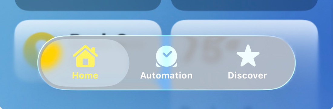

Now, at this size when displayed on a computer, it's not so bad. But keep in mind you're using it on an iPhone, which is smaller. And, if you're old like me, you have to hold it out so you can see it without reading glasses on. Apple desperately needs to refine this. Or even give you a way to turn the glass off so people with poor eyesight can read everything more easily...
What a mess.
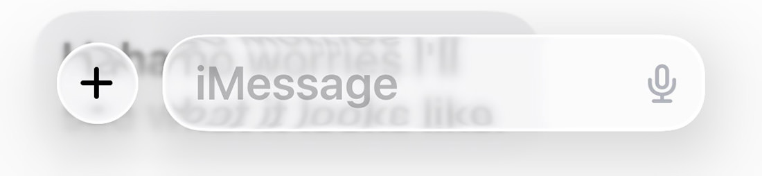
Another quick observation before I take my leave of you... many of the icons look blurry. It gives me a headache.
![]()
Not at computer size so much... but iPhone size at a distance. Just look at the Photos app icon here...
![]()
But more tomorrow when I've had a chance to play with it all a bit more.
* If you've never seen Bedazzled (the Elizabeth Hurley version), I give it my highest recommendation. Here's that entire scene...

I love comments! However, all comments are moderated, and won't appear until approved. Are you an abusive troll with nothing to contribute? Don't bother. Selling something? Don't bother. Spam linking? Don't bother.
PLEASE NOTE: My comment-spam protection requires JavaScript... if you have it turned off or are using a mobile device without JavaScript, commenting won't work. Sorry.
I mostly like it with the biggest exception being control center. That clearly need some frosted glass treatment behind it. The blurry icons are inconsistent for me. Even in your shots above, the Photos icon only sometimes looks blurry. On my in phone, if I’m wearing my computer glasses (~30” focus), then it does appear blurry (despite most detail seeming sharp enough). But with my progressives, it looks sharp. I do have dark mode enabled, which I think helps a bit.
The overriding problem for me is that things feel overly-complex in areas where they shouldn’t. I am not sure if it’s because I’m not yet used to the changes… or if they’re actually more complex. For example… when I take a screen capture. 99 times out of 100, I just want it saved. I don’t want to edit it or draw on it or search with it or export it somewhere. Yet all those things are one tap away. To save it, I have to hold down on the check-mark icon, then save it. Why? It’s more than a little bit bonkers.
And there it is, the exact initial feedback I was reading/listening. The Accidental Tech guys (Marco, Casey, and John) have, er, not very nice things to say about it. https://atp.fm/643
It’s incredibly strange how Apple, which strives for clarity and usability, picked one of the most unclear and unusable interfaces they could find.
I feel like the icons have been given the “Lucille Ball as Mame Vaseline on the Lens” treatment. Way too fuzzy.
And I can’t believe that nobody at Apple said… hey… wait a minute…