


 Have you ever loathed a company just because they have a horrible logo?
I do it all the time. If you've got a terrible logo, I just assume that the company itself is also terrible, so I avoid it. Unless somebody convinces me otherwise, I'm taking a pass based on aesthetics alone.
One of these companies is Canada's own "The Bay" (AKA "The Hudson's Bay Company"). I'll never forget being in a mall in Canada and coming across this pile of crap...

Now, granted, I'm a graphic designer and have a more critical way of looking at branding... but, yeah, this is atrocious. The "B" that's barely a "B" at all and the mixed typography is just all kinds of nightmare fodder.
Though, to be fair, I think it's leagues better than this shitty Pepsi rebrand from 2008...
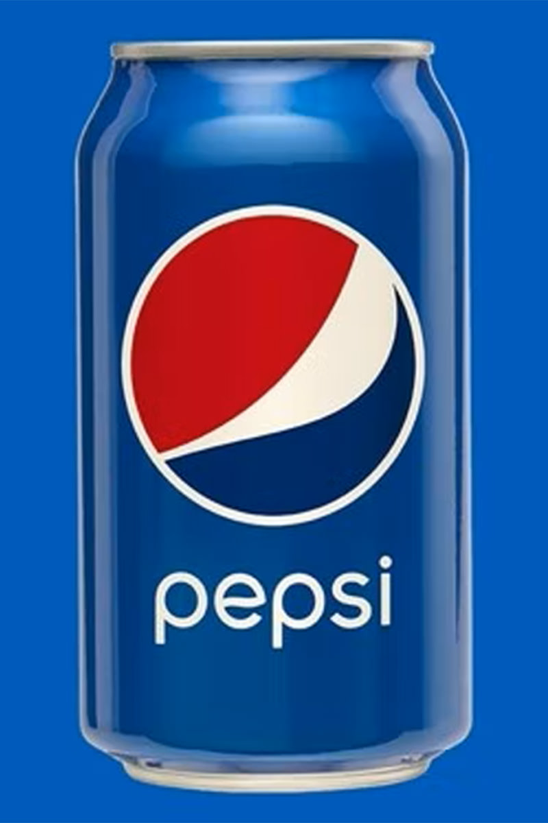
What the fuck even is that? Fortunately, Pepsi came to their senses a couple years ago and ditched this abonimation for the classic logo. But the fact that it took them fifteen years to do that is pretty bad.
But anyway, back to The Bay. I found out today that they went bankrupt...
I was about to say "GOOD!" because it meant that I wouldn't have to worry about happening across that truly terrible logo ever again. But then I found out that they did change it to something not shitty in 2012, which I didn't even know.
Oh well.
Guess retail is rough outside the USA too.
Especially when you have a logo which has people actively avoiding your business.

I love comments! However, all comments are moderated, and won't appear until approved. Are you an abusive troll with nothing to contribute? Don't bother. Selling something? Don't bother. Spam linking? Don't bother.
PLEASE NOTE: My comment-spam protection requires JavaScript... if you have it turned off or are using a mobile device without JavaScript, commenting won't work. Sorry.

There's no comments here...