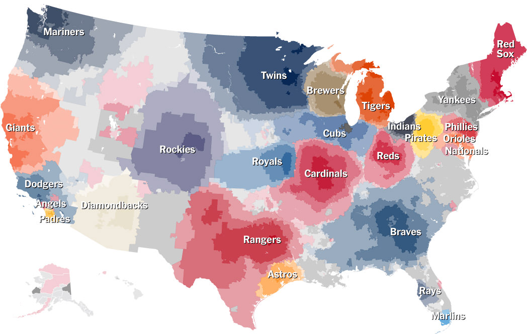
 Last year The New York Times ran an article about mapping out team loyalty when it comes to baseball. It looked pretty much as you'd expect. So I kinda glanced through it, nodded my head a few times, then moved on.
Which, as it turns out, was a mistake.
I was reading an article this morning where they were discussing how Facebook can be data-mined to ferret out all kinds of cool information. And the first example they gave? The NYT baseball borders map from last year...

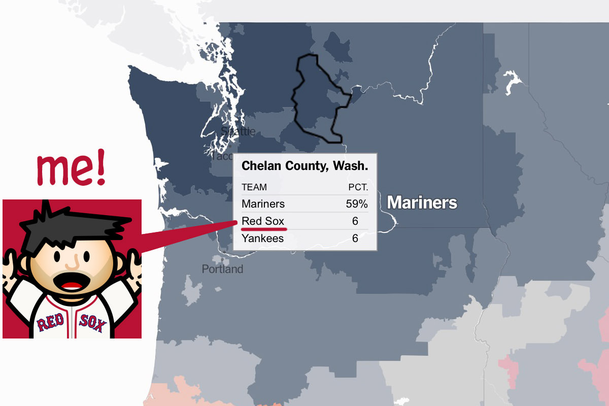
And here is what I did not know... the Facebook data that's been mapped out is highly specific. The further you zoom in, the more it gets broken down. Here's a zoom into the county level where I live. And, guess what, THERE I AM...

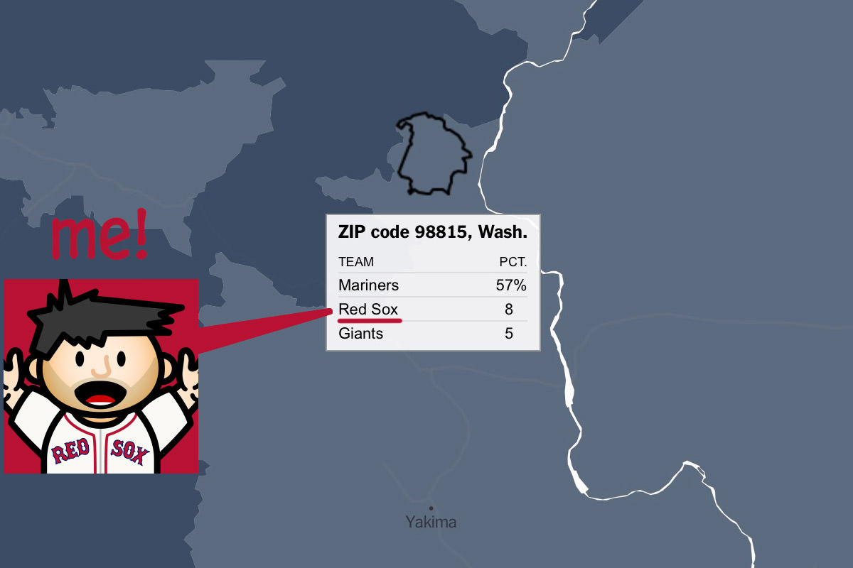
But that's not all. If you zoom in even further, you can search out your zip code...

For all I know, all eight of those percents is me!
The interactive map is pretty great if you have any interest in baseball... take a look!

I love comments! However, all comments are moderated, and won't appear until approved. Are you an abusive troll with nothing to contribute? Don't bother. Selling something? Don't bother. Spam linking? Don't bother.
PLEASE NOTE: My comment-spam protection requires JavaScript... if you have it turned off or are using a mobile device without JavaScript, commenting won't work. Sorry.

There's no comments here...