
 This is my obligatory entry dedicated to Apple's latest release of MacOS X version 10.5, code-name "Leopard." As a Certified Mac Whore, it's unavoidable.
Yet, I realize that most everybody reading this probably doesn't care about my Macintosh obsession, so I am also publishing pictures of a freaky-ass fountain that was built on Piazza Navona in Rome. It's the Fontana di Nettuno (Fountain of Neptune) and no matter how many times I see it, I still freak out...
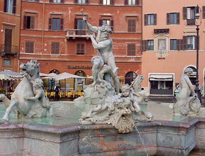
The sculpture features a bad-ass god of the seas (Neptune) battling an octopus while naked sea-nymph babes ignore him. That much I get. Well, not entirely, because it doesn't make much sense that the god of the seas would go around stabbing octopuses for no apparent reason, but whatever. This part of the statue is relatively sane. What bothers me is everything else. Starting with the freaky little kid playing with a crab on the head of some kind of water demon...

Well, at least he was playing with the crab before his arm got broken off. But still, WTF? That's some pretty freaky shit right there. Almost as freaky as the kid who's trying to rip the tongue out of a horse that's leaping out of the water...
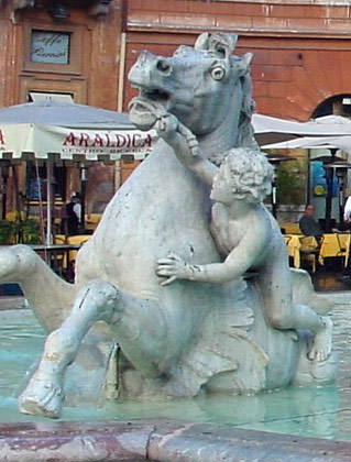
What the horse is doing in the water I have no idea. And from the look on his face, neither does he.
Usually I would attempt to make some kind of story out of all the bizarre stuff that's going on, but I've given up here. Apparently Neptune throws some crazy-ass parties.
And now it's Leopard time. In an extended entry...
Everybody with a blog or major publication has already given their opinion on Leopard, so this is not going to be a comprehensive review by any means. I just want to toss out some things that I've run into from using the new OS this past week (mostly the stuff that bugs me). Overall, I am quite pleased at yet another stellar Apple MacOS X release. This is not to say that there isn't room for improvement, there definitely is, it's just that Leopard is a darn fine experience and makes me happier than ever I am a total Mac Whore.
Leopard: Packaging
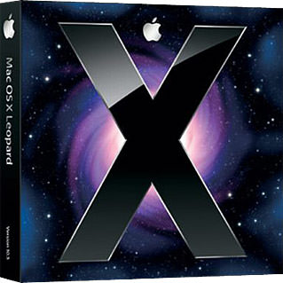
Quite a few graphic designers have decried Leopard's packaging as cheesy and unprofessional. I disagree. I think the packaging is attractive, true to Apple's audience, and works quite well with the overall identity and branding that Apple has built for itself. The amazing holographic technology used on the box is mesmerizing, and the overall design is pleasing and fresh...
Leopard: Purchasing
I own at least a dozen Macs because I simply don't have the heart to throw them away when they're replaced. Of those I own, five of them are used regularly. 1) MacBook Pro: which goes with me everywhere. 2) Mac Pro Desktop: which is where most of my work is done. 3) Mac mini Media Server: which is hooked up to my television to serve photos, movies, music, and such via Apple's Front Row software. 4) PowerBook G4: which has some of my older client work on it and travels with me from time to time. 5) PowerMac G4 File Server: which is the hub that manages all of my files between my various machines. I went for the Leopard "Family Pack" which allows me to upgrade all 5 machines at an attractive price of $199 (instead of having to purchase five at $129 each... a whopping $645). The software was purchased at The Florida Mall in Orlando at one of Apple's beautiful retail outlets.
Leopard: Installing
For my MacBook Pro I did a simple upgrade-install that worked perfectly. For my Mac Pro I purchased a clean drive and installed Leopard fresh, re-installing all my apps and syncing with .Mac to get all my settings restored, which also went perfectly. Both the PowerBook and PowerMac were upgraded using the "archive and install" method allowing you to get a fresh copy of Leopard, but maintain your settings, and also went perfectly. The only problem came when upgrading my Mac mini Media Server. I have three login accounts on the thing, and running the upgrade pretty much hosed them all. Things never quite worked right, and two accounts completely lost their keychains and preferences. I ultimately wiped the entire disk and installed Leopard fresh, which worked fine. Fortunately, I had a full back-up before I started, and recommend anybody upgrading do the same. Apple may be better than most where upgrades are concerned, but shit does happen.
The Finder: General
Apple's file browser/manager has some minor improvements in Leopard, but mostly in aesthetics, not in functionality. There's no longer the duality of "white stripes" for some apps and windows and "brushed metal" in others, for example. Everything is more visually consistent, which is a nice improvement (except for folders and The Dock, which I examine below, and the menu bar which is now inexplicably transparent). Unfortunately, nuts-and-bolts file functions are still abysmally bad. Copying hundreds of files, for example, STILL ends up with mysterious errors and failures, requiring me to use a third part app like ChronoSync to get the job done. It seems sad that basic functionality like this is broken, and leaves me dreading other inevitable problems that are sure to pop up (like not being able to eject mounted volumes while the trash is emptying, and icon previews not always working in icon-view, but somehow showing up in a search under icon-view). You'd think Apple could get it together after FIVE iterations, but improving the most-used aspect of their OS appears to be a low priority. For day-to-day tasks the Finder is an adequate, but hardly elegant, tool.
The Finder: Cover Flow and Quick Look
Apple continues its love affair with Cover Flow that began with iTunes, iPhone, and the new iPods, by integrating it into The Finder. This unique method of viewing files is very handy for folders containing photos, media, and documents, because you can zip through files visually to find what you're looking for...
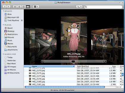
Once you DO find what you want, you can view it instantly with Quick Look, just by pressing the space bar. This is very cool for taking a peek at PDF documents, spreadsheets, and the like, without having to take time to open an application. You can even view movies. The only downside I've found is that I don't like Quick Look's slideshow. The old Tiger slideshow would go full-screen, but show the images at actual size or lower (if the image was too big for the screen). Leopard expands even tiny images to fill the screen, which is ugly and impractical. It would be nice to have the option to go back to the old (better) display option...

The Finder: Folders
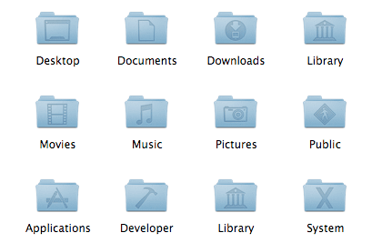
What. The. Fuck? I wasn't totally enamored with the old MacOS X folder icons, but the new ones are so heinously bad that it leaves me wondering if Apple hired Microsoft to design them. Tragically ugly and notoriously difficult to get a visual handle on, The Finder's new folders are just defectively awful. Even worse, the System and User folders have all been redesigned with an "embossed" mono-color icon that makes them all but indistinguishable from each other. Apple is famous for the elegance, usability, and beauty of their GUI elements, so I ask again: what the fuck happened? My guess is that they were made horrible so that they worked better visually on Apple's redesign of The Dock. But at what cost? Can YOU tell them apart at a glance? Because I sure can't...
The Dock: Appearance
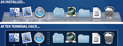
What. The. Fuck? As if the folder icon tragedy wasn't bad enough, the new Dock is fucking armageddon. Awash with a nonsensical 3-D appearance and accessorized by an etched-glass "swoosh" across the surface, everything that could possibly go wrong with Apple's launcher/desktop repository has been brought to life here. It's as if usability and functionality were summarily tossed out the window in favor of something which was designed specifically to confuse and piss-off the user. Fortunately, a quick hack with Terminal can improve things dramatically, but what in the hell was Apple thinking here? I have yet to read of ANYBODY liking the idiotic new Dock (with the possible exception of Steve Jobs Himself). Stupid, stupid, stupid.
The Dock: Stacks
A good feature that's implemented badly, Stacks drive me crazy with potential unrealized. The idea is that you can get a quick look into any folder placed on the right-hand-side of The Dock with a single click. Brilliant, right? But not so fast. First of all, System and User folders lose their unique (albeit shitty) icons when used as Stacks. In the view below, for example, it's impossible to tell that you are looking at the Documents folder, Library folder, Music folder, and Public folder... they're all the same because they take on the blank folder icon of their contents...

But wait, we're not done yet! As I mentioned, Stacks take on the icons of their contents. It's supposed to be clever but, in reality, it's just profoundly stupid. With a fresh Leopard install, for example, the "Applications" folder has the "Address Book" icon in front, because that's the first item in my by-name-sorted apps. Just when I'm getting used to the fact that the Address Book icon opens up all my Applications, I install "A Better Finder Rename" and suddenly I have to re-learn what my Applications folder looks like, because "Address Book" is no longer the first item alphabetically...

This is stupid on a level that I would have though incomprehensible at Apple. They just don't DO idiotic shit like this! But here it is. And the worst is yet to come. The "fan" layout of stacks gives you this pretty pop-up display of a folder's contents. The problem is that it's difficult to navigate a curved path AND they put arguably the most sought-after location... THE FINDER... all the way at the top of the stack! The picture below shows only four folders in the way of The Finder, can you imagine a dozen? That's a lot of wasted mousing for no real benefit...
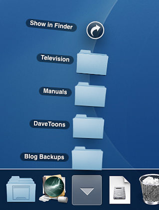
I'm going to try and "fix" these massive problems the best I can... creating a folder named "0000" with a distinguishable icon in each Stacked folder, and then setting my Stack View to "grid" instead of "fan" for a start... but why should I have to go to the trouble? Why did Apple, with decades of utterly fucking brilliance in interface design under their belt, create something that's so undeniably BAD? I can't answer that question, but Steve Jobs... or whoever is calling these shots at Apple... needs to go back to Square One and rethink this shit so it actually works, because Apple can't do moronic crap like this. They. Just. Can't.
Spaces
I've been a big fan of virtual desktops for years, and Apple has decided to add a very good implementation of VD (hah!) to Leopard called "Spaces." In a nutshell, virtual desktops allow you to create a gigantic desktop and then divide it into viewable sections like a grid. For the most part, everything works as advertised, and the Spaces overview allows you to arrange things until you're happy, which is pretty sweet...
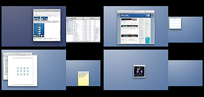
You can even dictate that certain applications will always open in a specific Space (or all Spaces), which is sweet too. There are minor problems... some apps (like Twitteriffic) don't follow the rules... but overall the hotkey shortcuts, auto-switching, and good configurability makes Apple's Spaces a real asset to my work. Number one on my wish-list for future versions would be the ability to make a second monitor "Space-less" so that it stays consistent between views, but it's all good.
Time Machine
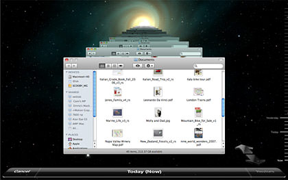
The shining star of Leopard's feature set which Apple has been touting since early previews is their new back-up solution called "Time Machine." In a word, it's brilliant. In two words, it's fucking brilliant. This is backup software exactly how it should be done... no obscure file formats and freaky recovery bullshit... just an elegant and simple solution that works amazingly well. All you do is attach a removable drive, click yes, and Leopard handles the rest. From there, you can either browse the backup drive directly and access your files as you would with any storage volume (nice!) or you can use the Time Machine interface, which is one of Leopard's more controversial aspects. All too often I read about what a "travesty" people feel the GUI on Time Machine is, but I'm just not jumping on that bandwagon. Yes, it's freaky. Yes, it's not very Mac-like. Yes, it's kind of comical and cheesy. But that's all secondary to this one fact: it's dead simple to use. And isn't that what you want when trying to recover a lost file? Simply click on the Time Machine icon in The Dock, and your window is transported to a spacey vortex that goes back in time. All you do is browse back to when your file was there, select it, click "Restore," and you're freakin' DONE! Amazingly intuitive and totally why I love Apple...
Spotlight
I've always hated Apple's "universal search technology" which they've dubbed "Spotlight" because it's slow and the "search as you type" feature is insane. Seriously, if you wanted to search your Mac for files containing the word "stupid" Spotlight wastes valuable time trying to find files with "S" then "ST" then "STU" then "STUP" then "STUPI" and finally "STUPID" with every new letter you type... which is just brain-dead. Well, Leopard still doesn't give you the option to turn this off, but it is a lot more responsive so you don't have to hate it as much. Other positive changes include boolean searches (yay!) and such niceties as dictionary lookup and calculator functions. A big improvement, but far from perfect.
Dictionary
So much improved it deserves a paragraph, Leopard's dictionary has many more options for looking up words and phrases, including Wikipedia and a Japanese translation tome. It's not perfect (try looking up "laugh" in the Japanese translation and ponder why such a common word doesn't appear), but is appreciated. One of my favorite additions is an Apple dictionary, which allows you to look up a (very) limited number of Macintosh programs, terms, and such. Cute.
.Mac Services: iSync
The only feature I really need out of .Mac is their iSync service, which allows me to sync a lot of settings and information over multiple Macs with little effort. It's a great idea, and Leopard has improved things by adding the ability to keep your Dock, Dashboard Widgets, and other stuff in sync too. Sweet!
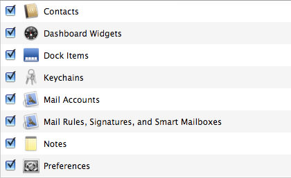
Unfortunately, while iSync works fairly well for the most part, it fucks up more often than not, and things seem to be even worse in Leopard. Why the hell Apple can't get their shit together on so vital a feature of a service I'm paying $99 a year for is just beyond me. Automatic syncing has NEVER worked right, and Leopard has made this feature virtually unusable. Right now I am getting "first time sync" messages EVERY DAMN TIME any of my Macs try to sync, and once that is dealt with, all I get is inexplicable errors...

It's this never-ending crazy buggy shit that has me questioning my decision to renew .Mac every year. WHY DOESN'T APPLE FIX THIS STUFF?!? Ultimately I renew my subscription because the sync services (flawed they may be) are just too valuable to live without... but I always regret it afterwards.
.Mac Services: iDisk
Still so slow to almost be unusable. But at least with Leopard the entire Finder doesn't freeze up while you are waiting for the stupid thing to mount. The fact that Apple can't build a WebDAV service that runs at a decent speed WHEN THEY ARE CHARGING MONEY FOR IT is pretty embarrassing. How is it that Panic can build a good iDisk client into their Transmit FTP software, but Apple can't figure it out?
.Mac Services: Web Gallery
And here is where I go ballistic. .Mac's new "Web Gallery" service allows you to upload and manage photos on the web with a beautiful browsing client. Even better, it is integrated into iPhone, which makes it twice as useful. All-in-all, it's a wonderful new addition that I like very much. Except... Apple has to go and ruin it by being a complete and total asshole about access. Case in point: I own an iPhone, I subscribe to .Mac, and I use Apple's pricey Aperture professional photo management software. Basically, I am paying for three Apple products that can make good use of Web Galery. Or so you would think. Turns out the only way to actually CREATE Web Galleries is to purchase ANOTHER Apple product: iLife. Except I don't need iLife. I use Apple Final Cut Pro instead of iMovie, I use Apple Soundtrack instead of Garage Band, I use Apple DVD Studio instead of iDVD, and I use Apple Aperture instead of iPhoto. Buying iLife is just a redundant purchase of higher-end (and much more expensive) Apple apps I already own. So why the fuck does Apple force me to buy iLife to create Web Galleries on a .Mac service I am already paying for? Hell if I know, but it totally sucks, and Apple can kiss my ass (after taking their Web Galleries and shoving them up theirs). There is such a thing as "doing right by your customers" and this is one point where Apple is dropping the ball. Badly.
.Mac Services: Back To My Mac
This service allows you to connect with your other Macs via the .Mac service so you can control said Macs remotely and have access to their resources. Pretty sweet, right? Except it doesn't work. Access over the same network works, but only for a short while before the connection mysteriously drops. Access over the internet doesn't work at all... even when I enable all the NAT crap that Apple tells you to do. Pretty frickin' embarrassing for Apple to be advertising a Leopard feature that clearly is not ready for prime-time.
.Mac Services: WebMail, Homepage, and Whatever
I use these features on occasion, but they're so unreliable that I've pretty much given up on them. Again, why can't Apple fix this stuff? It's just insane that they charge people $99 a year for shit that is worse than what Google and Blogger offer for free.
The End
The above is but a tiny sampling of the 300 new features Apple is advertising you get with a Leopard upgrade... most of which do not suck and are totally awesome. iChat is revolutionary, again, allowing you all kinds of brilliant video conferencing options that are ever so dreamy. Apple's Safari web browser continues to define what a web experience should be, and Mail has gotten the nifty ability to sync To-Do lists and Notes, which is a lot cooler than it sounds. FontBook now has auto-activation which mostly works quite well. The new Dashcode development environment for creating Dashboard widgets is superb, and has me wanting to update the widgets I wrote. The list goes on and on, and I haven't even mentioned how much snappier and faster everything feels.
Overall, Leopard is a boost to Apple's already dominate position in the OS market. It's beautiful, functional, and refined in a way that Windows Vista just isn't (and probably never will be). This makes their missteps with The Dock, Finder folders, and my other complaints all the more frustrating, but I guess no OS is totally perfect. Hopefully, it will just give Apple all the more room for improvement for version 10.6 in a few years.

I love comments! However, all comments are moderated, and won't appear until approved. Are you an abusive troll with nothing to contribute? Don't bother. Selling something? Don't bother. Spam linking? Don't bother.
PLEASE NOTE: My comment-spam protection requires JavaScript... if you have it turned off or are using a mobile device without JavaScript, commenting won't work. Sorry.

I miss Rome.
Oh yeah, and I wish I had a Mac 🙂
That is a spectacular sculpture. It may not make sense but it’s absolutely gorgeous. Thanks for posting it.
This is so, SO complicated my head is spinning. How do you do all of this stuff! HOW. How did you have the time to write all this!
Your writing here is just amazing, as good as I’ve ever seen it. You are absolutely in your element here, so that even though I didn’t understand like, okay well, really any of it, it was still a real pleasure to read. That is an outstanding thing to be able to say about someone, so good on you, geek.
oh. i like the new dock.
I have seen those horses in other sculptures, and they’re usually like “mer-horses.” Yours appear to be, as well, because they look like they have fins on their sides and the beginnings of scales going into the water. There’s a gorgeous one in DC that’s kind of like this. I love it. Can’t explain it one bit, but I think it’s kind of cool.
About the horse: Neptune (Poseidon) gave the horse to the Athenians in a bidding war against Minerva (Athena) to be chosen as official town god.
Minerva outbid him with the olive tree and was chosen.
I have a bunch of Macs at home but as Apple doesn’t let me use my iPhone rebate GC to purchase it, They’ll just stay on Tiger a little longer.
I don’t understand half of what you just said simply because I don’t own the Mac but I have to say that I am bookmarking this entry for when I do!!! What a thorough and amazing post….
I’m having a similar love-hate affair with Office 2007 – so many cool new things, but so many “basic” things simply broken! ARGH! My blood pressure’s going up just thinking about it.
Um… wow.
I’ve not jumped into the Leopard pool yet. I just barely upgraded the hard drive on my MacBook Pro 15″ CoreDuo 2ghz from the 100gb is came with to a 250gb model. I went with the safe bet of keeping Tiger on it until some updates come out (namely, Adobe Acrobat and Premier Pro CS3) that are Leopard compatible.
But Time Machine is one of the main reasons I would upgrade. My friend bought a new Mac mini with Leopard and loves it.
P.S. thanks for your email help. Using actual HTML code to imbed a URL link was the one thing I didn’t try… Doh!
Pfft.
Great write-up. I in so much dread of Windows Vista that I may not buy a new PC just so that I can avoid it. My son is begging for a fully loaded MacBookPro for a graduation present.
My only question with Time Machine… if you restore to an old setting, what happens to anything you’ve done after that point on your machine? Is it still there? I would assume so, but still worth asking.
You restore FILES… not the state of the computer. So no, nothing done since the restore is lost… and, if there’s a conflict, you are asked whether to replace the newer file, forget the older file, or keep both. It’s total genius, really.
That fountain is pretty bizarre. I thought Neptune’s trident gave him dominion over sea creatures sort of Aquaman style so he wouldn’t need to fight them.
Anyway… loved the OS review. I don’t always comment on your mac posts, but I find them totally helpful. I’m still running 10.3 which is mostly fine for me except for the increasing incompatibilities with new softwares I have interest in. I think I will hold off for now while I consider upgrading to an intel Mac next year.
Does Leopard run well on your older machines? The last time I upgraded an OS was on a PC years ago and everything ran slower afterwards. My mac more than meets the tech specs required for Leopard, but I’m leery of messing up what I’ve got.
Leopard rules!!! no other way to say it. fast, clear, beautiful. no viruses either.
Neptune’s sacred animal was horses – he’s credited with giving horses to man. That’s because when horses sweat, they work up a lather – which looks like sea foam. Mythology explains natural phenomenon, so it sort of makes sense that they associated horses with the god of the sea.
Um, that extended part was written in Greek, right? I wish I understood the finer points of what you said, because it was written so well. This is why my career is in health care and not technology.
I must admit, one of the better write-ups of Leopard that I’ve had the pleasure of reading. Nicely done.