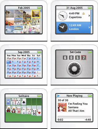
 After a very full day at work, and a run to Wenatchee for a scary visa photo, I finally had a chance to watch the Apple Media Event that His Royal Steveness streamed via QuickTime.
It made the iPod nano look even more desirable.
All because the smaller size does not mean lesser functionality. They even added features to it. Usually, this would be a down-side to me because I feel elegance lies in simplicity... but since I don't lug around a clunky PDA, I am kind of digging the photo album, world clock, calendar, address book, and everything else... all in such a tiny nothing of a package. So very sweet for the wayward traveler.

I totally can't afford one because my "toy allowance" went to Katrina relief this month, but I suppose that's what credit cards are for.
I ordered mine in white, because it seems so much more classic.
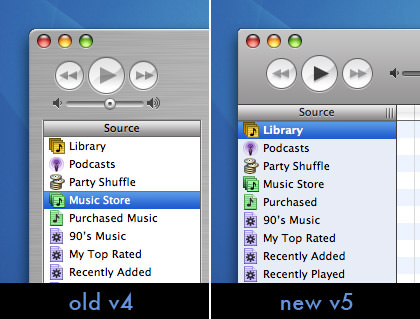
After plunging myself into debt (yet again) I took some solace in the fact that the latest v5 release of iTunes was a free download. In the SteveNote, I could tell that Apple has started to diminish the now-antiquated "brushed metal" effect. What I couldn't see (until I installed it) was that the new streamlined look comes with a glaring bit of retro-harshness. The once beautifully rounded corners have bin nipped off with a clunky little edges that aren't even anti-aliased. Brutal.

I'm not sure what to make of the lack of window edges. It seems that if Apple revises their OS windows this way in the future, they'll all kind of blend together badly. That frame around the edge may make the window bigger, but it serves a purpose. The bizarre thing here is that it's yet another level of disjointed interface elements within the MacOS that keeps drifting further and further into clumsy abandon. If they keep mucking it up like this, soon we Mac users will be worse off than those poor Windows-using bastards we make fun of.
Did somebody accidentally toss out the Macintosh Human Interface Guidelines book at Apple?
UPDATE: Strange. I just noticed that iTunes 5 has the capability to store lyrics as part of the song information. How many minutes until somebody writes a tool that automatically downloads them from a lyrics server and pops them into the files. I wonder if there is a way to display the lyrics in lieu of the "visualizer" within iTunes?

I love comments! However, all comments are moderated, and won't appear until approved. Are you an abusive troll with nothing to contribute? Don't bother. Selling something? Don't bother. Spam linking? Don't bother.
PLEASE NOTE: My comment-spam protection requires JavaScript... if you have it turned off or are using a mobile device without JavaScript, commenting won't work. Sorry.

Dude, I was about to make a post saying the same thing about the iTunes interface. I’ll have to check it out on Windows but suffice to say I’m not digging it. Bring back to v4.x interface!
The search feature, however, looks good – very Spotlight-esque.
I agree. The border served a useful purpose, helping you not to drift outside into another app. Also, at least on Windows, the vertically-compressed gray area makes for much more difficult selection of not only menu options, but especially of minimize/close icons, which are now itsy-bitsy tiny. For example, the minimize icon (frequently used) is only 4 pixels from “Burn Disc”. I’d rather the gray area use 10-20 more pixels of space, and show one fewer song.