


 Unusually humid and 90° Fahrenheit with more thunderstorms on the way?
Not my favorite weather.
And so another episode of THRICE Fiction has been put to bed. This issue has some amazing stuff in it, arrives wrapped in a beautiful cover by Kyra Wilson, and it's absolutely FREE to download, so what are you waiting for? Head on over to our official site and grab a copy!
As I was on a conference call this morning, I took the time to write up some "Art Director Notes" which discusses my thinking behind all the visuals that are in this issue. If you're interested in that kind of thing, I've put it all in an extended entry. Needless to say, SPOILERS abound, so you might want to go read the issue before you click through...
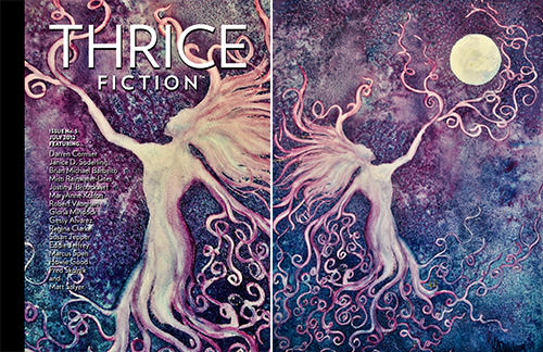
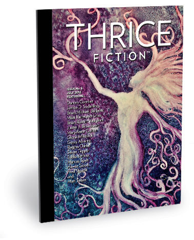
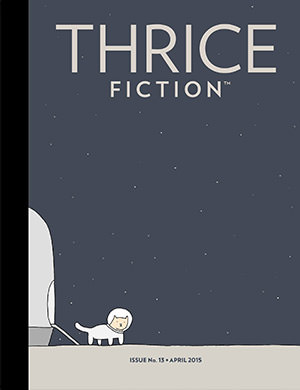
FRONT COVER. The cover of the magazine is always a source of stress for me. Sometimes it comes together easily, such as when Echo Chernik let us use her amazing work for our second issue. Other times it's a series of disasters that ends up with my creating something just to make the insanity stop. For this issue there was an artist I really wanted on the cover, but multiple emails and Facebook messages went unanswered. So then I found another artist whose portfolio was stunning. But they waited until the last minute and threw something together which (even they admitted) wasn't cover-worthy art. And then, just as I was ready to sketch out something myself, Kyra started sending me one stunning work after another for the stories she was given. I got to this piece, which she titled "Entrammel," and just couldn't leave it alone. The colors and textures were all just sublime, and I wanted it pretty bad for the cover. Luckily for me, she agreed. It's actually a crop of a larger work where the "tentacle lady" is reaching for the moon. But the moon obstructed the logo, so I couldn't use the full work. It's kind of a shame, because the composition is perfect, but I still think this is an amazingly powerful piece and couldn't be happier with having it grace our fifth issue.
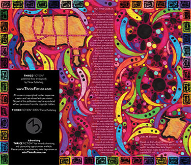
INSIDE FRONT COVER. John M. Bennett has been contributing to THRICE Fiction since issue no.1, and I'm always anxious to see what he's going to give us next. I refer to his work as "visual heroin" because he uses words like musical notes to paint my brain. With "Not This Cabeza" he didn't disappoint, and I tried my best to provide a fiesta of visuals to match the feast of words he unleashed. The only thing I knew when I started is that I wanted to pull influence from Spanish, Peruvian, and Incan art, seeing as how Mr. Bennett was being inspired by El Inca Garcilaso de la Vega (which is a man worth Googling, to be sure). I don't know if the result entirely succeeds in reflecting this, but you can see the influences if you really look. "Cabeza" is the Spanish word for "head," and I knew in Mexico this is what they call the meat that comes from a cow's head, so I decided to make that the subject of the painting. I thought that if the person looking at the piece knows what "cabeza" is, it was pretty funny. If they didn't, hey... at least it's colorful!
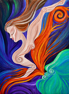
PAGE 2. I thought this was a beautiful companion piece to the front cover and was the perfect accompaniment to RW's notes for this issue. Kyra calls it "They'll Never Know," which adds some heartbreaking context to the painting. Again, I regret having to crop the photo, as Kyra's sense of composition here is beautiful.
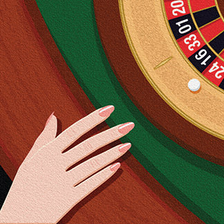
PAGE 3. When Susan Tepper had sent in a couple stories set in Monaco, it was like kismet. Since I had just been there less than two years ago, I had a lot of photo reference material. And I had been to the famous casino, so I had personal experience to add when it came time to create visuals for her stories. But, after re-reading the two stories several times, I felt that trying to capture Monaco itself was the wrong approach. Instead I searched for little moments that would reflect the story and went that route. For "Casino" I was kind of mesmerized by the description of the woman's hand resting on the mahogany roulette table edge, and how the entire structure of the story seemed to be pinned to that moment. It seemed a natural, so I decided to go for something iconic... opting for a very clean illustration style.
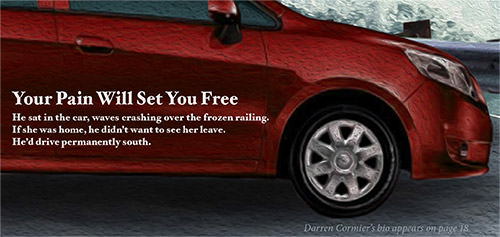
PAGE 4. Darren Cormier's little micro-fiction pieces are just mind-bogglingly good. Very early on in the planning for this issue, RW had recommended sprinkling the pieces around the magazine, and I felt this was an excellent idea. My initial thought was to make the art look like magazine advertisements so the reader would expect a hard-sell... but then get a little story instead. Eventually I abandoned the idea because I worried people wouldn't even look at the bits if they thought they were actual advertisements. But this one was already done and created to look like a car ad. I ended up cropping into it quite a bit so it wouldn't be TOO much of a car ad though!
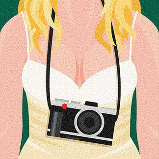
PAGE 5. The image of a blonde German woman having a camera hanging over her cleavage would not leave my head as the art for "The Photographer." She was, after all, the photographer in question! Susan described the camera as being sleek and professional. Since the woman is German, I went with a Leica for the make, which is a German manufacturer. If there are any camera geeks out there, I drew a Leica X2, which is a camera I'm dying to own... mostly because it's so sleek and professional, exactly what was described!
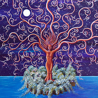
PAGE 6. This is a piece from Kyra called "Dryad." I felt it was the perfect art for the text, because the arms of the woman in the painting are all-encompassing and far reaching, which was kind of the thrust of the story, I thought.
PAGE 7. Kyra painted this abstract (titled "Whim") just for the story, and it's a pretty remarkable work. Yet another piece that I wish I didn't have to crop, but it's so powerful that I don't think it suffers too much.
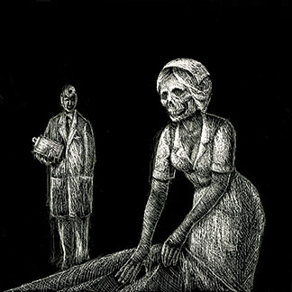
PAGE 9. I read this story and had no idea how I was going to approach the art. I figured that I'd end up doing something iconic from the military and then try to twist it into something darkly themed so that it would intrigue the reader to dive in. Nothing I sketched was interesting enough, so eventually I passed it to Chad to see what his take might be. Of course, he nailed it. The art for this does exactly what you want the art to do for a story... set the tone and give a glimpse of what you're in for, but without giving anything away. The fact that it's so beautifully disturbing in execution is just the icing on the cake.
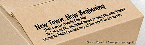
PAGE 11. Since Cormier's pieces are so wonderfully simple, I didn't want to overwhelm them with the art. I just wanted a simple tidbit to set the stage so Darren could amaze people with his ability to condense an entire novel into a couple sentences. Having an unopened packing box seemed to fit the bill here.
PAGE 12. To try and summarize Barbeito's fascinating imagery in a 2-1/4" square piece of art would be folly. So I latched onto the odd people he describes and paired it with a work by Kyra she calls "Identity." It works perfectly.
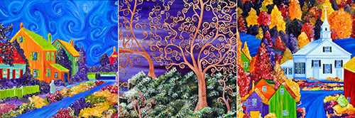
PAGES 13-16. Kyra had sent me these pieces for Clarke's "Hot July Night" and I was hesitant. In my head, I thought the story was crying out for simple slices of Americana rendered in very traditional style. But any attempt at going this route just didn't mesh. I finally asked a colleague what they thought, and they told me I was insane, because Kyra had given me exactly what I needed all along, and the paintings she had chosen were perfect... "This photo of the town with the heat waves swirling in the night sky... IT'S A HOT JULY NIGHT! This photo of the swirly trees... THAT'S WHERE THEY CARVED THEIR INITIALS! This photo of the small town church... THAT'S HIS HOME TOWN HE WANTED TO BRING HIS WIFE TO SEE!" I found it impossible to argue with that logic, so there you have it. Just a tiny bit of extra info... on page 15 if you zoom in on the tree trunk, I added a few marks there to indicate that this is where the initials were carved.
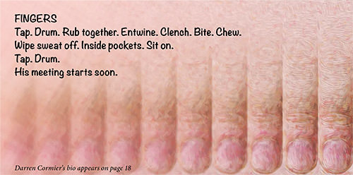
PAGE 17. I took a photo of my finger, duplicated it nine times so there would be ten of them, ran it through some painting filters, then progressively blurred them to try and convey unrest and motion. Simple!
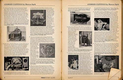
PAGE 18-19. I have a pretty steadfast rule about the design layout for THRICE Fiction... we don't alter it. When I get the stories, I flow them into one of three "templates" I feel works best, then add whatever art I need to make it fit the space properly. Then repeat that until I'm done. Some would say this inflexibility would be restrictive... I maintain it's professional. So when RW sent me "Android Clippings," which came with a slew of images author Marcus Speh had selected, I was understandably upset. There was no way to fit the story and visuals into any of the templates. But the piece was so darn entertaining that it was impossible to reject it! So I decided to turn the whole thing into a double-page art piece and call it good. I love that some of the "clippings" are from the future... but Speh paired them with old images. I took it a step further and put it in a photo of an old book. This was a lot of fun to do.
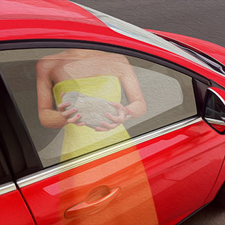
PAGE 20. If I had to pick just one page as a favorite from THRICE Fiction so far, this would be it. The minute I read this micro-fiction bit of genius, I knew exactly what I wanted to do with it... treat it as I would a 5-page story! Because, honestly, it may be a single line, but it fills your head with five pages, so why not? I pretty much knew what I was going to create for the art... a woman with a rock being reflected in a car window that was a prelude of what was to come. But actually creating it was really tough. I went through SIX versions before I found what I wanted. And then I ended up making it too small, so I had to do it a seventh time so it wouldn't be all blurry. My technique for these kind of "paintings" is always the same. I hack together a bunch of reference photos, trace over the result, draw in the various areas of color, then manually paint in "helper" lines so that Photoshop's "Oil Paint" filter does what I want. It would probably be faster for me to actually (literally?) paint the thing, but this way I don't get paint on my clothes.
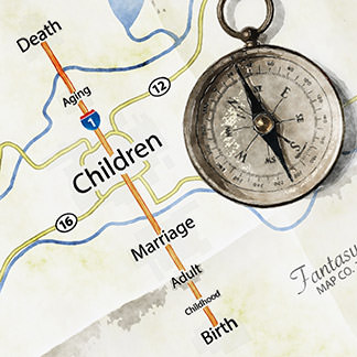
PAGE 21-23. I am not a huge fan of "slice of life" fiction, so I glanced at MaryAnne Kolton's "Map of Reality" and put it aside until I could figure out what artwork I could pair with it. Eventually I sat down and actually read it all the way through... then felt horribly bad for having discounted it so quickly, because it's probably my favorite story in the entire issue. Yes, it's "slice of life" fiction... but it's just told so amazingly well. It haunted me for days as I tried to come up with an idea for the art that would do the story justice. Eventually I figured out that I really didn't need to go any further than what MaryAnne had put on the page... life is about trying to follow a map you've drawn for yourself and dealing with the detours along the way. So I drew that literal "Fantasy Map" we all make for ourselves, then interrupted the story with road signs as the reader makes their journey through the author's words. I still don't know if I did the story justice, but MaryAnne's ending has a bigger impact than any pictures I might put around it, so I try not to worry about it too much!
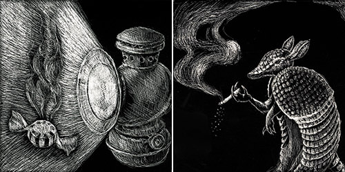
PAGE 24-25. And here's where Chad once again saved my bacon with two really good short stories that were screaming for imagery I knew I couldn't do a very good job of capturing. But Chad knew exactly what was needed, so all I had to do was sit back and wait for him to send in art that I knew would work perfectly. He did not disappoint. The miner's lamp was a genius touch, and that's one cool armadillo!
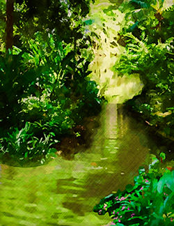
PAGE 26. Originally, I had created an old-time travel poster here in the style of famous "It's a Small World" artist Mary Blair. I thought that her child-like art would be a really good fit for showing the people in the boat in a way that doesn't intrude on the story. But then I scrapped it because the joy of Fred Skolnik's wonderful story is the amount of detail he pours into the characters. You feel as if you are on that boat with them, and any attempt by me to compete with that would be comical. So I went for an abstract river forest scene instead, hoping to merely introduce the reader to the piece rather than try and set a mood or interpret the words. The story has no need of that, and so I'm happy to oblige it.
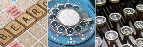
PAGE 28-29. When taking disparate stories and putting them on a single spread, I try to find some common element that I can use to bind them. Once I found out that "letters" would work... letters on Scrabble tiles... letters on a phone dial... letters on a typewriter... it was as if mana fell from heaven, and everything came together. Thank goodness for iStock Photo, which had exactly what I needed to use for each element! Hopefully all three pieces provide just enough intrigue to get a potential reader interested, because all three of these shorts are a handsome reward.
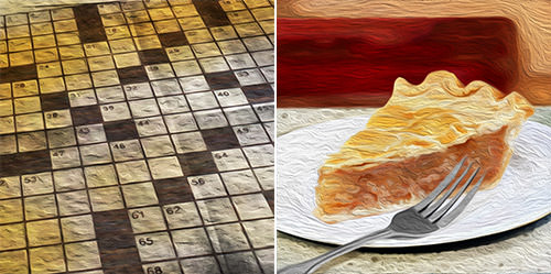
PAGE 30-34. This story was so flat-out fascinating to me that I was daunted to take it on. What I wanted to do was go with the dogs for the art. But after a half-dozen times reading the story, I knew in my gut that was the wrong approach. So I became determined to not go with literal interpretations, but instead try and hint at elements of the story. For the first piece, I merged the urine-stained newspaper with the description of newspaper-covered dogs looking like a crossword puzzle into a single visual that I thought got things off to an interesting start. For the second, I merged the speckled white Formica counter with a slice of pie from the glass pie case and a red vinyl seat into one image that I thought brought a nice story element to life.
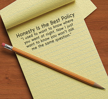
PAGE 35. Originally, I wanted the words to Cormier's final micro-fiction to be drawn on an empty bed, but that was assuming too much. Then I wanted to have a painting of somebody with their fingers crossed behind their back, but didn't know if it would be completely understood as irony. Finally I decided to just put it on a notepad, which is how somebody would tell their significant other that they wouldn't be home that night. I don't know that everybody will "get" this, but I think it works quite well.
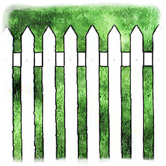
PAGE 36. I wanted to set the stage of a typical "home" in the suburbs with a white picket fence so that Vaughan could step in and blow it to pieces with his funny bit of fiction. Usually I struggle a bit in trying to decide which story will anchor the entire issue. I knew this piece was the ticket the minute I read it.
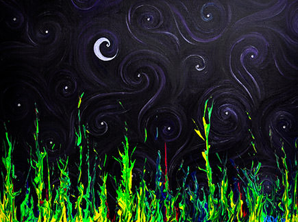
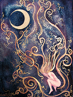
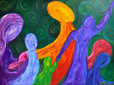
BACK COVER. More Bennett imagery heroin, beautifully accompanied by Kyra's painting "Midnight Flame." Even though the painting wasn't created for this piece, it sure feels like it could have been!
And that wraps another issue. See you in four months!

I love comments! However, all comments are moderated, and won't appear until approved. Are you an abusive troll with nothing to contribute? Don't bother. Selling something? Don't bother. Spam linking? Don't bother.
PLEASE NOTE: My comment-spam protection requires JavaScript... if you have it turned off or are using a mobile device without JavaScript, commenting won't work. Sorry.
Amazing job. All around.
I’m so looking foward to seeing this issue. Beautiful!
And I love how much care and thought you put into the imagery and how it fits in with the pieces. It really shows in the book; the visuals are as satisfying as the fiction.
Dave,
Love the intense thoughtful way you consider each piece to bring exactly the right artistic take to it. They are all so fine!
I loved being part of THRICE. Thank you for the opportunity! 🙂
I really loved the visual of the woman with the rock in the window, I felt it was perfect!
Fascinating account of how Dave Simmer put the issue together with the artists and art. It came out looking splendiferous!!!
Looks awesome!
I always like reading the details of how you create these great finished products. Amazing to know how it all gets to the point of the final product.