
 Tomorrow I will be flying off to Seattle late at night so I can catch an early plane to Santa Fe the following morning. Yes, TequilaCon 2009 is finally at hand.
My first TequilaCon experience was #3 in Portland, Oregon for the history-making 2007 bash. I had actually planned on attending #2 in New York the previous year, but I couldn't work it into my schedule. This is indeed tragic (and one of my few regrets in life is that I didn't try harder to attend), but life goes on. Albeit not as well as it could have.
Anyway, now that Jenny has posted the Official TequilaCon 2009 Poster over at her Official TequilaCon page, I thought I'd write up another "Behind The Scenes" entry that everybody seems to like so much. This time on how this year's poster was created.
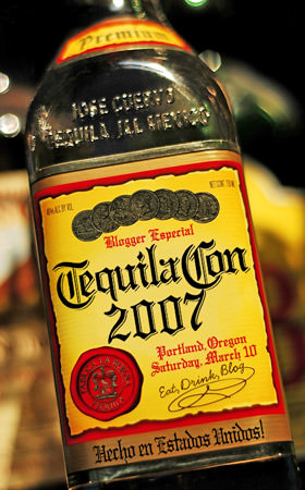
When plans were coming together for TequilaCon 2007, the perfect venue had been decided... The Kennedy School. It's a former schoolhouse that was converted into a nifty hotel, bar, and restaurant complex. The only problem with such a place is that it's massively huge. There was a very real concern that people would show up to the event and not be able to find each other! That's when I came up with the idea of making posters for the registration table in Brandon's room, and name-badge lanyards for all the attendees so they could find each other. There was no direction on what these things should look like, so I thought it might be cool to alter a Jose Cuervo tequila bottle and use that. I found a fantastic photo online, paid the photographer for a release, and two hours later the first Official TequilaCon Poster was born...
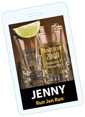
The lanyards were a hit, so when TequilaCon 2008 was in the planning stages we decided to do them again, even though the venue didn't really require them. Initially, I had no plans on revisiting the "bottle" idea from the previous year. Instead I was going to use a shot glass and etch the info on the side of it, as shown by this lo-res lanyard badge sketch...
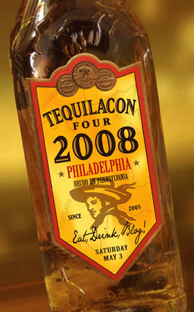
It was a nice concept, but it didn't offer nearly the impact from last time. Even worse, what would I do for the future TequilaCons which would certainly follow? It would be nice if everything somehow tied together from year to year. That's when it dawned on me that there were hundreds of different tequila brands out there, and my best bet was to just choose a different bottle each year. Taking my camera to the local liquor store, I decided Pepe Lopez had a fantastic label that would look nice when modified so I snapped a few photos, painted in my own background, and the second Official TequilaCon Poster was created...
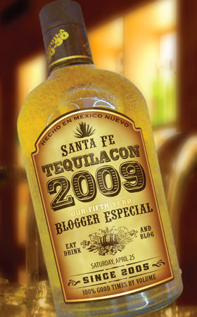
This year, the lanyards and posters were a no-brainer because people have come to expect them (we also discovered that they come in handy when you drink so much that you forget your own name). The only issue confronting me was which bottle to use. Vahid sent me a number of great suggestions, and on one of the pages was a bottle of 30-30 that seemed a perfect fit. Their label is really distinct and beautiful, so the decision was easy. What was not easy was finding a bottle of it that I could photograph because my local liquor store didn't carry it. Fortunately, the store in a neighboring city did, and the rest is history...
If you want to see all the gory details on the image was made, I've put the whole story in an extended entry...
The photo of the bottle was taken right at the liquor store. I found a spot with even lighting, laid it on the floor, and got down on my knees to take the shot...
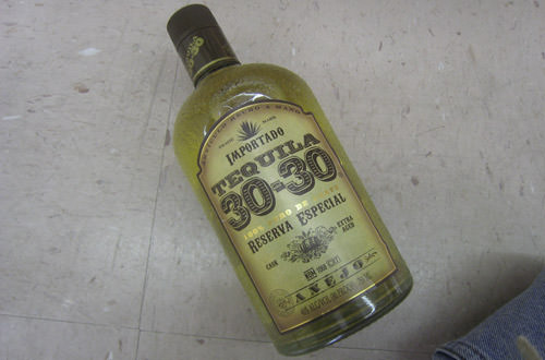
This photo looks pretty terrible, but it was all I needed to get started. The first thing I did was cut the bottle out of the background, touch up a few bad spots, remove the label, and color-correct the bottle so it wasn't green...
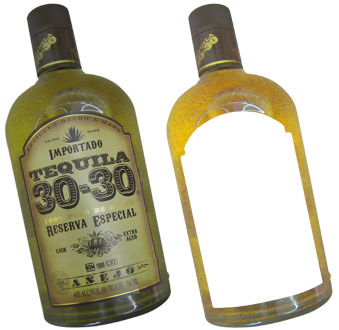
Next up was the hard part... creating the replacement label. The idea here is not to try and get an exact match, but instead to create a customized version of the label that mimics the spirit of the original. This is not as easy as it might sound, because anything I come up with has to be readable at small sizes... otherwise the little image I use on the lanyards would just turn into a big mess. The most difficult part of the process is trying to figure out how much you can change and still have something that resembles the original. After those decisions are made, it's just a matter of tracking down similar fonts and drawing up any artwork.
From here the project splits into two parts... 1) repainting the label background, and 2) constructing the artwork needed to go on that background. I keep the two pieces separated as long as possible so it's easier to make changes. The only thing kept from the original label was the oak barrel graphic, which I took from the photo so I wouldn't have to redraw it...
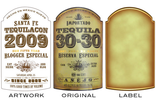
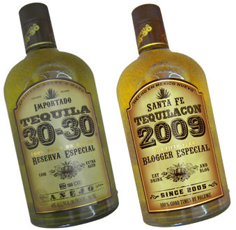
Again, it's not about making an exact duplicate... all I need to do is come close. Several adjustments were made at this point to improve readability. My first version had a hyphen between "20" and "09" because the original has one between the "30" and "30." As much as I wanted to keep it that way, all it did was confuse things, so I dropped it. Once I have everything as I like it, it's time to run a quick comparison...
When it came time for a background, I was going to just paint something random like I did last year. But at the last second I changed my mind. Instead I would just blur out a photo of a pub's bar. This would add an air of authenticity to the finished image, so off I went to iStock Photo where I found this...
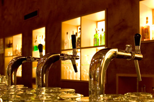
Perfect! The light coming in from those liquor shelves has the "Santa Fe sun" vibe I wanted, but it still looks like a bar. All I had to do was add blur, do a little color correction, drop the bottle in, add highlights, and repaint some of the details. After ten minutes of tinkering (and about two hours total work), the third Official TequilaCon Poster for 2009 was done...

And that's all she wrote.
Until next year...

I love comments! However, all comments are moderated, and won't appear until approved. Are you an abusive troll with nothing to contribute? Don't bother. Selling something? Don't bother. Spam linking? Don't bother.
PLEASE NOTE: My comment-spam protection requires JavaScript... if you have it turned off or are using a mobile device without JavaScript, commenting won't work. Sorry.

i’ll miss yinz. perhaps i will try to drown myself in booze this weekend to forget the fact that i am not there with yinz.
That is insanely awesome.
Love the behind the scenes!
Have fun this year and I’ll see you at TC10!
Awesome.
Great work, Dave! That bottle was a good pick. Plenty of space for all the details.
Awesome Dave2, loved the you explained the process.
Awesome. I leave on Friday, exciting!
I love the poster – and the behind the scenes look. Thanks for that 🙂
You make it sound easy, Dave. Thanks very much for sharing your process. I like learning about photo manipulation/design.
Did you ask about taking the photo at the liquor store first?
No. But I did tell them I took it afterwards as I was paying for my stuff. Last year I DID ask in advance… they didn’t have a problem with it. Probably because I then went on to spend $120. 🙂
You are a fucking da Vinci. I bow in awe of your kick-assedness.
That’s a lot of work. And greatly appreciated
see ya in a few days.
i still have one of those original laminated posters in my wardrobe. i am man enough to admit i occasionally touch myself inappropriately in front of it.
Wow, I do love these behind-the-scenes. It really is a fantastic job powered by some creative talent.
So far, we have on blogography.com:
BTS (behind the scenes)
GTS (google that sh*t)
DTS (acronyms for dumbasses)
UTS (bUlleT sunday)
MTS (monkey T-Shirts)
What’s next in the xTS world of Dave, mewonders.
I love this year’s poster SO MUCH! You keep outdoing yourself each year, Dave – it’s really perfect! Anybody know if 30-30 is any good?
Are you telling me that when we met in 2007 at the Kennedy School…that was your first Tequilacon? Wow. I had no idea. Have a blast, you guys. And do behave, would you please….
You are so talented, dude. Seriously.
See you in a few days. 🙂
As always, informative AND awesome. 🙂
Wish I was going to be there, but we ran through our substitute budget like well, tequila, so I goes nowheres. Bah.
Have fun!
Love it! Both the result and the behind-the-scenes.
See you soon!
Thanks for sharing how you made this. Really cool stuff! Have fun, and share all the drunken madness…especially in pictures.
Please have twice as much fun on my behalf!
I wish I could go, but I never have time or money or… you know, friends. 🙂 But have a safe flight!
My Tequilacon 2008 badge is one of my most treasured Possessions (is that spelled right? looks funny)
Was my first blogger event as well… Hangs on my kitchen wall for everyone to see!
Thanks Dave! Bummed I’m gonna miss this year.
Very nice. Now if only I could be there… *sigh*
Awesome!!!
I was thinking of the worm as a cartoony badge…
Such talent and creativity all wrapped in a Dave package. Who could ask for more?
You have mad skilz. The font is an amazing match.
I love your “behind the scenes” posts.. keep them up 🙂
BEAUTIFUL work Dave. : )
I think it’s HILARIOUS that Rachel got pulled out of line by TSA and got her tequila confiscated. We will drink ours tonight BEFORE the plane ride home, and make sure the bottle is very obviously empty. 🙂
Fantastic design!!!! I love the sign and the bottle.
As I’ve said before, I LOVE this behind the scenes posts. I am in awe of your graphic artist skills and it’s no wonder these posters and lanyards are a hit.